SIX SENSES
Award-Winning Packaging Design & Visual Identity for a Snack Brand in Macau
EUTOPIA developed the brand strategy, visual identity, and packaging design for SIX SENSES, a Macau health snack brand that reimagines the concept of local souvenirs. The challenge was to transform traditional gifting culture into a modern design experience that blends health, heritage, and aesthetic value. We set out to create a brand that not only represents wellness but also embodies the artistic and cultural essence of Macau.
Brand Positioning Strategy
We positioned SIX SENSES around the idea of “Awakening the Sixth Sense,” symbolizing balance between mind, body, and emotion. This concept expresses a heightened awareness that connects sensory experience with cultural appreciation. By combining the modern wellness narrative with Macau’s heritage, the positioning highlights how SIX SENSES brings mindfulness and artistry together to redefine what a contemporary souvenir can represent.
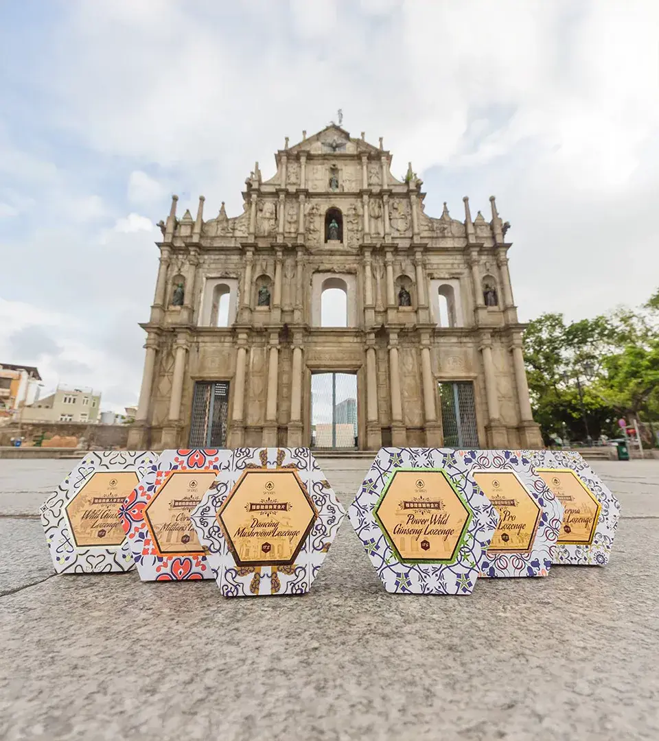
Packaging Design Strategy
The packaging design centers on a hexagonal rigid box structure that symbolizes harmony, balance, and the “six senses” concept. Each box features a unique Portuguese-style pattern paired with an illustration of a different Macau landmark, creating a collectible series. From materials to structure, every detail was designed to merge functionality with storytelling, transforming the brand into a cultural gift that celebrates both design and heritage.
Logo Design Approach
The logo design for SIX SENSES is based on geometric precision and visual balance. Its minimal wordmark uses refined spacing and harmonious letterforms to communicate clarity and sophistication. The subtle curvature reflects the brand’s sensory essence, simple, timeless, and emotionally calm. Integrated seamlessly within the broader visual identity, the logo serves as a confident emblem of authenticity and trust.

Visual Identity Design
We created a visual identity system that merges Portuguese-inspired elegance with modern minimalism. The design language draws from traditional ceramic motifs and architectural symmetry, paired with a soft color palette that conveys purity and calmness. Typography inspired by European craftsmanship adds refinement and structure, expressing the brand’s cultural sophistication while maintaining clarity and modern appeal across all applications.


Celebrating Culture Through Award-Winning Design
SIX SENSES successfully established itself as a modern symbol of Macau’s cultural and wellness values. The brand’s packaging design won multiple awards in Macau, Hong Kong, and Shanghai, recognized for its innovation and craftsmanship. Through EUTOPIA’s creative direction, SIX SENSES transformed from a local snack into a design-driven souvenir that celebrates culture, creativity, and a renewed sense of perception.
3.1M
Customer acquisition growth
4.3X
Strong brand visibility expansion
95%
Positive reputation sentiment
3.6X
Steady marketing ROI improvement
Related projects


